Hi team,
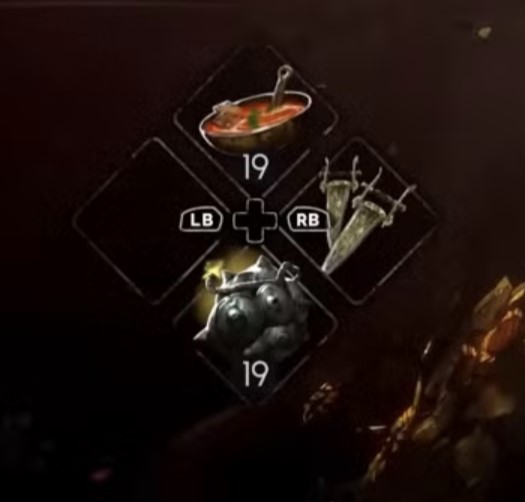
First off, loving the game and really appreciate the direction you’re taking with No Rest for the Wicked. I’d like to suggest a small but important QoL feature: giving players the option to choose between the old and the new action bar UI—the one that shows weapon skill access, healing, and food options.
I personally found the previous UI much more intuitive. The current version in the bottom-left corner feels a bit confusing to me, especially during fast-paced gameplay. I’m not asking to revert to the old version entirely, but rather to allow us, the players, to pick the UI layout that suits our playstyle best.
A simple toggle in the settings menu would go a long way in improving usability and accessibility for different preferences.
Thanks for considering it, and keep up the great work!